
Click to Pay

A shared digital checkout experience that lets customers use their saved payment cards across participating merchants, making online checkout faster, more consistent, and easier to recognize.
My role: Lead Product Designer - Visa
Partners: Content design · Research vendors · Product · Engineering · Architecture · EMVCo · Payment Networks
Scope: Vision → Strategy → UX framework → orchestration → industry standard

Every network wanted its own button
Consumers just wanted to checkout
What users faced:
Competing payment buttons
Different accounts and logins
Re-entering card details
Inconsistent checkout patterns
Uncertainty about what to choose
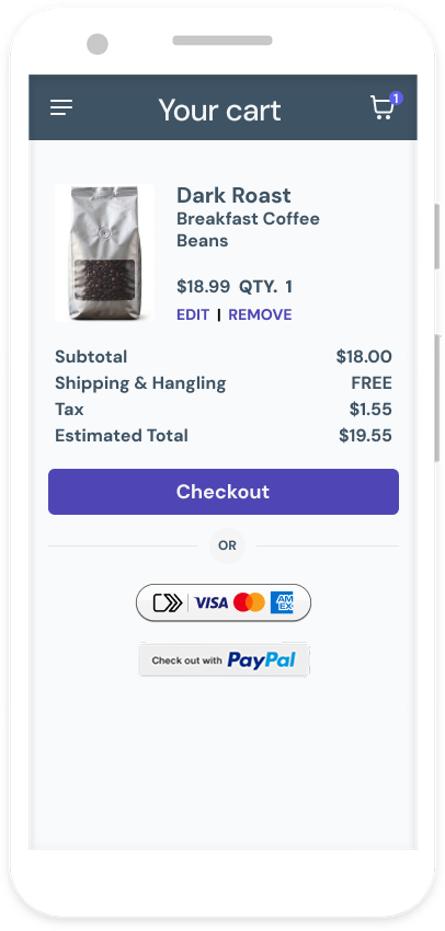
How might we build one checkout without erasing what made each network distinct?
The ecosystem problem
Every network ran its own checkout. Merchants carried the integrations. Customers carried the confusion.
The shift:
from a branded button to one checkout every network could share.
Five phases, one connected process
Research shaped the framework; the framework exposed technical needs, and those constraints fed back into testing.
01 DISCOVERY
Did users want one checkout?
02 FRAMEWORK
One XP every network could share
03 UI + ORCHESTRATION
Map each UI state to the APIs behind it
04 VALIDATION
Across users and different markets
05 SHARED XP + IMPLEMENTATION
Branding, and Guidance to scale it
01 DISCOVERY
Did users actually want one checkout?
I built a four-step research approach to test brand directions and find out what people actually needed at checkout.
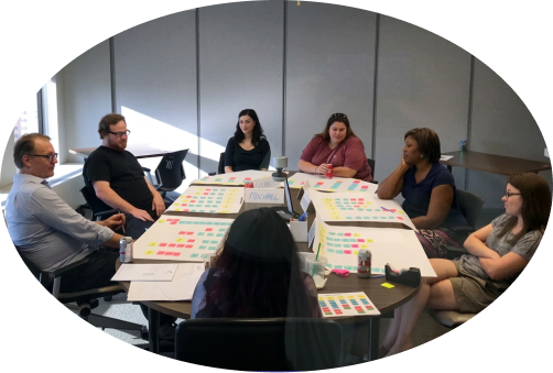
Focus group in Chicago, IL
Strategize
Testing frameworks, plus an exercise for participants to design their optimal checkout.
→ Evaluate
Test concepts and user flows in focus groups with 90 participants.
→ Iterate
Refine the concepts based on what we learned.
→ Prioritize
Use online surveys to test and narrow the next round of ideas.
Key findings
It read as convenient
People saw a faster way to check out, not another card-network product.
Trust came from the merchant and the network
Not from the checkout button itself.
Account creation killed momentum
New account prompts were the biggest source of friction.
Returning users expected their cards to be waiting
Anything less felt not optimal.
Mapping the Emotional Journey Through Checkout
02 FRAMEWORK
Turning the research into a shared checkout model
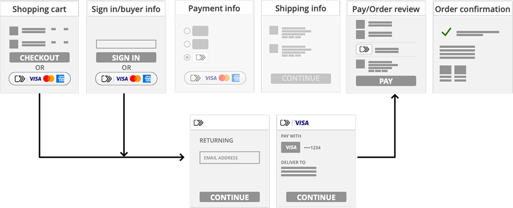
I used the research to define the core states every checkout had to support, no matter which network was behind it.
Returning user
Recognition
Know a returning user fast
Authentication
The lightest safe step to confirm identity
Card selection
Saved cards, easy to find and switch
Confirmation
One clear final action
Return visit
Faster than last time
Why it matter?
Consistent for shoppers. Distinct for every network.
03 UI + ORCHESTRATION
Designing the experience and the system together
I worked with architecture and engineering to connect every UI state to the APIs, network logic, and platform capabilities behind it, so the experience would hold up in a real integration.
Core orchestration layers
DSA · Digital Shopping Application: The site or app where checkout appears.
SRCi · Initiator: Collects and presents payment info to the user.
DCF · Digital Card Facilitator: Manages the digital credential.
SRC System: Moves payment data between merchant and banks.
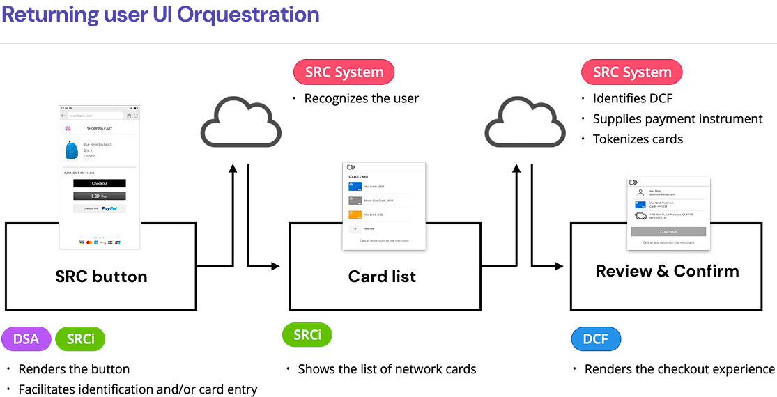
User interface orchestration for adding a new card
04 VALIDATION
Putting it in front of consumers
With a clickable prototype, I worked with the EMVCo UI Task Force to validate the experience across different regions.
EMVco
Is a global technical body where the major payment networks work together to define shared standards for how physical & digital payments should work.
What we needed to learn
Do users recognize it?
Do they understand what it does?
Do they trust the authentication step?
How much do they need to know before they'll use it?
Global Research
Phase 1
Qualitative
(50 interviews)
🇺🇸 n=20
🇩🇪 n=10
🇮🇳 n=10
🇧🇷 n=10
Phase 2
Quantitative
(20 minute online survey among 2657 participants)
🇺🇸 n=289 🇯🇵 n=296
🇩🇪 n=300 🇨🇳 n=298
🇬🇧 n=288 🇮🇳 n=299
🇦🇺 n=292 🇧🇷 n=302
🇸🇬 n=293
Used localized prototypes
🇧🇷 Brazil Version
Phase 5 – SHARED XP + IMPLEMENTATION
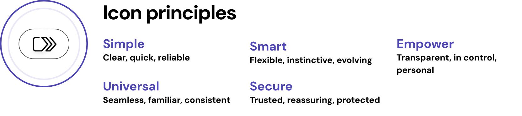
A name and mark people could recognize and trust
Trustworthy without belonging to any one network. I explored names, icons, CTAs, and button treatments, then used research to narrow the direction.
Names tested
Pay with card
Use my Visa card
My favorite card
CardPay
NetPay
PassKey
KeyCheckout
Pay+
Checkout+
Call to action
Pay
Click to Pay (winner)
Go
Checkout
Pay with card

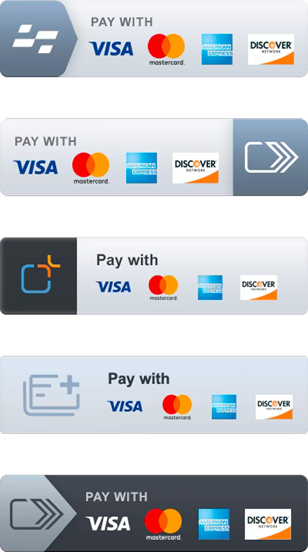
Button treatments

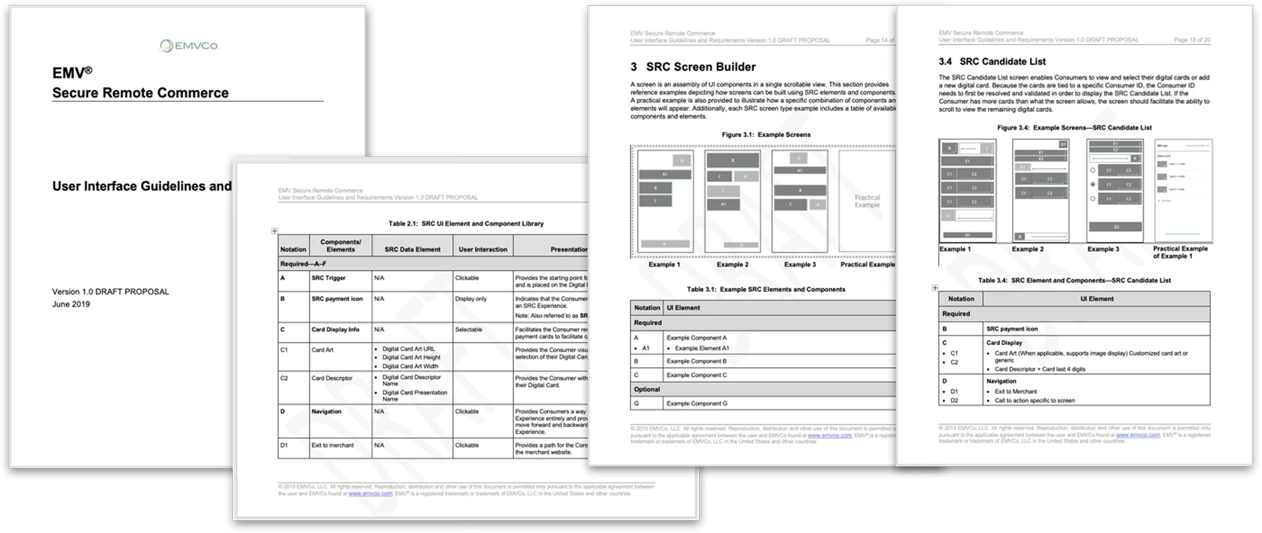
User Interface guidelines and implementation V1.0
I collaborated to deliver the first UX guidelines and implementation guidance, so networks and partners could launch consistently.
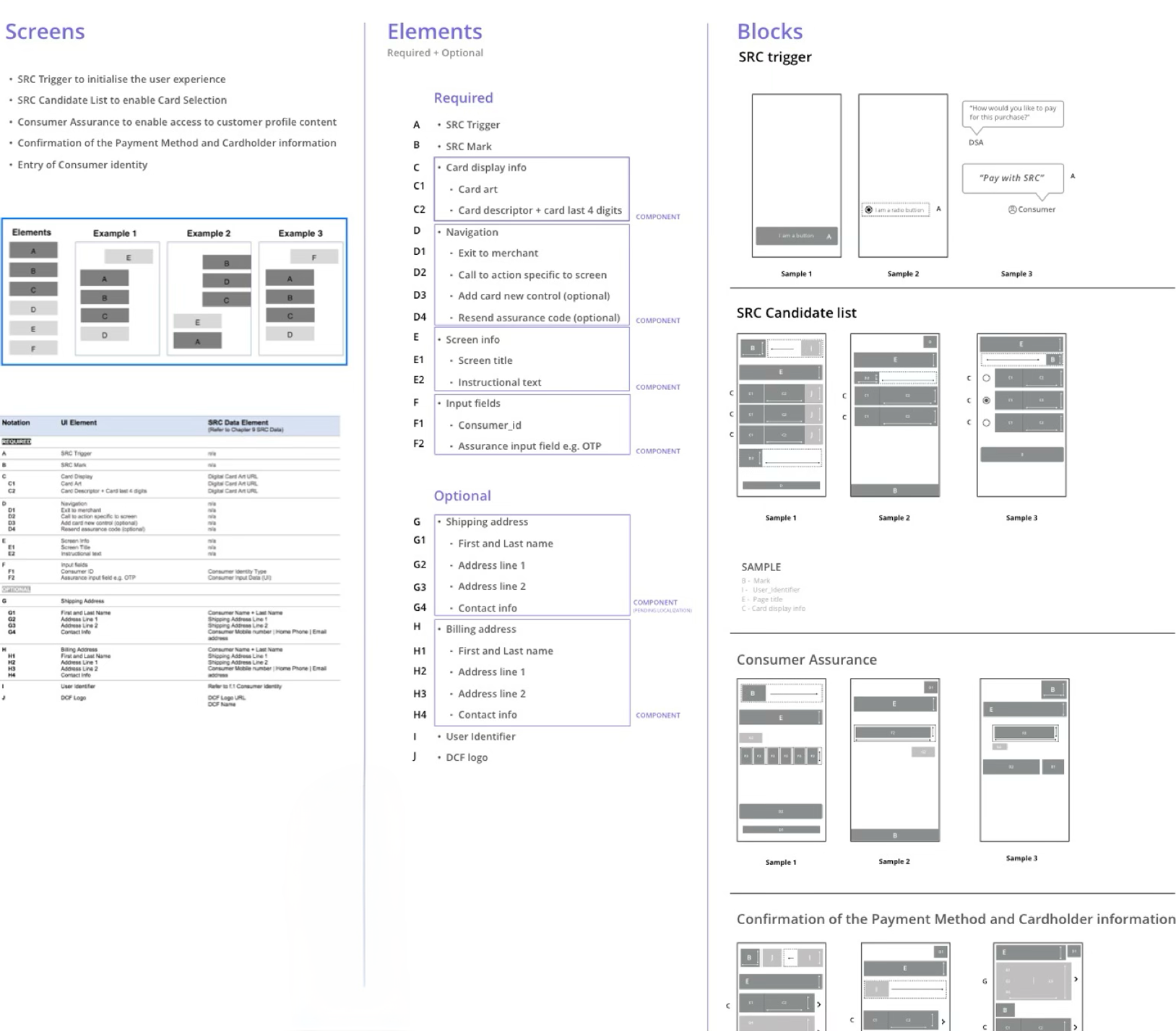
Global component library
Artifacts delivered
01 Shared checkout model
Experience states, journey, and interaction patterns across networks.
02 Orchestration + technical mapping
UI states connected to APIs, capabilities, and network decisions.
03 Prototypes + validation
Clickable flows tested across markets, refined through research.
05 Guidelines + standards
UX guidelines, implementation guidance, cross-network documentation.
04 Shared identity
Name, symbol, icon, checkout mark, button treatments.
From vision to merchant checkout pages
Lowe’s US merchant pilot launch
My impact
01 One pattern, not competing buttons
Consumers recognize one flow.
02 Easier for merchants
One build, multiple networks.
03 Unified UX and tech
Designed together, so it works in real integrations.
04 Proven globally
Tested across 9 markets.
05 Industry standard
Handed to EMVCo for collective ownership.